The eternal cycle that plagues us PC gamers is the constant need to upgrade our hardware, to keep up with the newest and shiniest games. It’s not just the fact that we need a rig that passes a new game’s minimum requirements and barely manages to run the game at all - we desire more than that. We want to play the game at its maximum possible visual settings, so that we can see it in its full glory. I’ve wondered, though, whether it really is just a craving for the best eye candy that drives that desire in me.
 When I play a game at less than maximum settings, there is a nagging feeling I get that is separate from the disappointment in the reduction of graphical fidelity, or the dismay that my PC is getting long in the tooth. I find myself wondering if I’m really experiencing the game as it was intended by its creators. Developers speak more and more about wanting to deliver an experience to gamers, and wanting them to play it just how they envision1. I think about the interpretation of what I see, and whether what I’m seeing is ‘canon’. If the object detail is down so low that I can’t tell what a character is wearing, am I missing a crucial point about that character? If I make a certain conclusion about a room that I wouldn’t have if I could only read the writing scrawled upon the walls, is my understanding of what happened ‘non-canon’? It’s a minor point but it’s something I keep thinking of in an age of games that are finally able to tell stories with every kind of narrative device available.
Of course, console gamers don’t face this dilemma at all. A console game plays the same on every unit of that console, and developers have a lot more control on how the game will look and perform without having to think about different hardware combinations and permutations. So I’m just restricting this thought experiment to PC games. There are a number of questions that follow this thought. Does it really matter if the graphics are not at the very max? Would you even be able to glean some higher level meaning or nuance from the details? Are we at the stage in game technology where this would matter, and developers can use this level of detail to add subtle enhancement to a games story and atmosphere? If so, in what games released today would it make a difference? A few games came to my mind immediately, and I’ll restrict my selection to just these few already installed on my hard drive so as not to belabour the hypothesis.
Having run through a few of the games for screenshots, I notice that the most common method of adding things to the world in order to enhance the narrative is to place detail textures in select places. Items like posters, decals and video monitors strewn all over the place are an easy enough way to make the environment seem more real and provide opportunities to convey key ideas to the player. Ultimately I suppose I’m not looking specifically at the term ‘canon’ but more at the ‘intended experience’ and what the player is supposed to see on their journey through the games.
2007 was an eventful year for gaming, and Portal was one of its biggest surprises. Stuffed into the Orange Box compilation amongst other big titles, it would have been overlooked if it weren’t for its refreshing puzzle mechanics and delightful storytelling. Much of the story was unravelled through the use of the environment, with writings scrawled upon the walls by the people that had passed that way before you.
")
")
")
")
Considering the minimal approach to narrative in Portal, these scribblings have quite a high priority in getting across ideas to the player. As you can see in the screenshots above2, though, the words are unreadable at the lowest texture settings. A key theme of the game is the isolation and loneliness of the test subjects, and the two high points in this otherwise dark setting: the weighted companion cube and cake. Someone playing at the lowest settings would miss these details, arguably missable but still enriching flavour.
Another critically acclaimed game that year was BioShock. Hailed for its literary headiness, it too is rich in story and utilises various devices in telling the tale of the failed utopia that is Rapture.
")

")
")
As with Portal, there is a lot of flavour detail in BioShock that just adds to the atmosphere and the overarching story of the world. Posters and billboards advertising plasmids are hung up on the walls throughout the city of Rapture. Every now and then you come across bloody messages painted on the tiles by deranged splicers. Though not essential to understanding the story, they all help the player piece together what happened to bring the once thriving city to its desolate state. As you can see those details are sacrificed in the name of performance, lost in a blurry mess. A player strolling past them without knowing what they say would probably not be able to appreciate the depth of the fiction that fleshes out Rapture and its short history.
")
")
")
")
However, it seems there are some decals that are deemed too important to be affected by the graphical settings. Early in the game, the player stumbles onto mad surgeon Dr. Steinman’s turf, and his twisted worldview is there for all to see in his crazy writing, low settings or high. It’s clear that the developers wanted to be sure the player understood what kind of person they were up against, a distinctive character with the motivation and means to be considered more than just an overpowered splicer.
Moving right along, I thought I’d stop over briefly on last year’s Left 4 Dead. Valve’s co-operative zombie shooter shares with Portal a minimalist attitude as far as story goes, with the focus on the replayable experience. The player gets to know what’s going on in the zombie-infested world of the game via two main devices, the characters’ dialogue and the … wait for it … writings on the wall.
")
")
As is very evident, there isn’t much difference in the overall quality of the game, and certainly not in the decals. The story is easily discernible on the most sluggish of rigs.
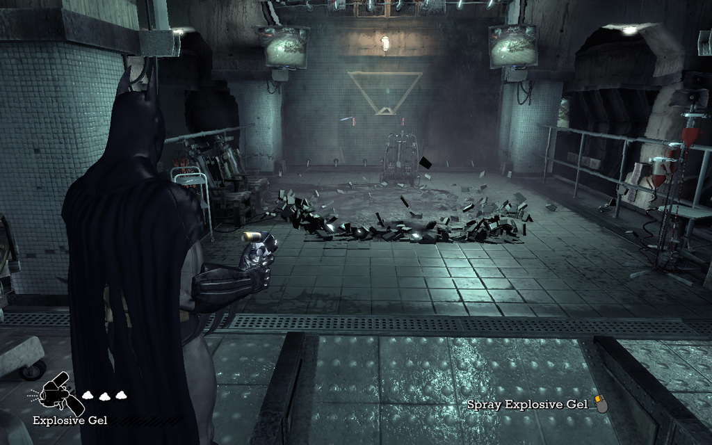
Before we conclude I would like to take a slight tangent in the discussion. So far we’ve only been looking at things in games that are simply decoration, that add to a player’s passive understanding of the world. But games have moved on from there, and now rely on these details to not only inform but require the player to engage and interact. Case in point: Batman: Arkham Asylum. We have already voiced our excitement about Arkham Asylum here at the Slowdown, being big fans of all things Bat. When the game finally arrived on the PC it didn’t disappoint, and delivered a fantastic experience like no other Batman game has. One of the things it does best is cram in so many elements into a relatively small area, making it feel like a living and breathing incarnation of the world we know so well. We mentioned the PhysX features in the demo review, and how it adds things like breakable floor tiles and fog particles. I don’t think we need to include this in our discussion, as it’s obvious that losing those things makes no difference to a player’s understanding of the game.
")
")
")
")
What I want to focus on is an interesting aspect of the game which is the Riddler’s challenge. Throughout Arkham Island are mementos corresponding to the various infamous characters in the rogues gallery - most of whom are not present otherwise - each of which the player is instructed to seek out. They serve the dual purpose of nudge-winks to fans and a source of experience points which players can use to upgrade their gadgets. Hence both story and gameplay are served in one stroke, and the player’s ability to recognise each item is dependent on whether the graphics can present a clear image of the objective. Above are a couple of the very few examples I could find that show a difference between lowest and highest settings. Exhibit A shows the Riddler’s own cell, dotted with his trademark question marks; with the textures turned down the symbols are less sharp but still readable. Exhibit B is a grim scene orchestrated by the sadistic Zsasz, with tally marks to signify his work. While all the objects in the room are reduced to blurry surfaces, the key items are still clear as ever, allowing players to identify the objective.
")
")
Most other cases are like Calendar Man’s cell, pictured here, hardly any change at all with the textures sharp and unblemished. So again we have a situation where the important objects in the environment are favoured so that the player can have pretty much the same kind of experience regardless of their system.
I guess my fears are a little unfounded, in this era of HD gaming when even low-range rigs allow us to play games more or less as their makers intended. Obviously my sampling is very limited to be making sweeping judgments like that, but I think it’s safe to assume games are not going to look like a mess of dirty polygons at minimum settings like they did a generation or two back. And as noted before, this is a console-led generation, which dictates the decisions behind the general art direction and quality of art assets. It also means I won’t have to upgrade for some time yet; with the technology bar almost stagnant during this console cycle I can rest assured I am going to be able to play games without my completionist conscience nagging at me to upgrade.
I think that’s the problem I know I will face. I want to be able to have the best settings just like I wanted a 1080p HDTV. I know that I have quite some time before we see anything sharper than blu-ray and 3-d gaming and viewing isn’t that desirable for me and it looks like that’s where we are headed first. I can see improvements on my Xbox 360 and PS3 games every year and the system itself doesn’t upgrade so to me that’s more feasable than this desire to have the latest video cards that come out more often than new gaming consoles.
Good point, Levelhead. Even if the hardware of the consoles stays unchanged, developers continue to improve their rendering code and squeeze more performance out of the machines, resulting in increasingly better-looking games in the same console cycle.
Don’t get me wrong, I’d love to invest into PC gaming. Who wouldn’t want the best possible gaming experience. However I just like knowing my games on my consoles don’t take effort on my part to constantly stay on top. OnLive seems to mix the two and maybe that will be a major shift in how we move forward.
I guess in a sense this is why there are so many arguments between console owners because game so and so looks better on one platform than the other. Especially between the PS3 and Xbox 360 community. On the PC you feel obliged to keep upgrading because you know it can look better and run smoother. This doesn’t work well on consoles. The hard drive on the PS2 and the add-on memory on the N64 are two examples. You then create a two-tiered system of the haves and have nots so it’s just easier to release a new system every 5 or so years. Microsoft is kind of stuck because they have to cater to the lowest common denominator and this means games must run without a hard drive even though they could be improved. It could be a messy endeavor especially if the PS3 takes off and becomes the lead platform.
Anyways I’m seriously thinking of getting into PC gaming. I feel it’s less restrictive and the games are cheaper but I want to see how OnLive does first.
“The eternal cycle that plagues us PC gamers is the constant need to upgrade our hardware, to keep up with the newest and shiniest games”
that could not be more false!
ive been a enthusiast PC gamer for over 10 years and have always kept up to speed with the latest tech.but now days that is not necessary.
what is the most demanding PC game?
crysis.
this year i built a 3K PC so i could play games the way they were meant to be played, i was expecting PC games to be leaps and bounds above console games the way they use to be.
but boy, O boy! was i wrong.
crysis is absolutely beautiful! the best looking game ever released, better than uncharted 2.
but thats about it, take batman AA, left for dead, left for dead 2, gears of war, unreal tournament 3, far cry 2, F.E.A.R, F.E.A.R 2, fallout 3, DMC4.
any PC game released in the last 3 years is better but not that much better than the console counterpart.
where are the PC games like crysis?
look at the ps3, every 6 months a new game is coming out raising the bar, same for the 360, but PC?
crysis is the best the PC has to offer and its a 2007 game :(
come on, what is the point of the new I7 processors, or ATIs new DX11 video cards?
if 2008 hardware can run crysis i want to see what 2010 hardware can give me.
every 6 months there is a new console game raising the bar for consoles, i want the same for PCs.
if a 2007 game looks like crysis i want to see what a 2010 game could look like.
and i aint waiting for RAGE, crysis 2 or half life 2 epp 3, because by the time those are out my great grandkids will have great grankids!
Trouble is Uncharted 2 and other PS3 games are not in native 1080p. You can set PC settings to beyond that I believe. You can also play games at faster frame rates. This is the problem with consoles because developers constantly try to push it as far as they can so what ends up happening is developers like Insomniac will no longer be doing 60fps games so that they can get better visuals. You can have both on the PC.
Sorry, meant to say very few PS3 games are in native 1080p. Play Batman on the PC with the highest settings and see the difference.
Admittedly, I was generalising and being a bit cynical, but if you’ve been gaming on the PC for long enough, that’s the conventional attitude. It’s only less of an issue at this point in time because we are in the middle of a console cycle, one that is perpetuating for longer than usual. Once the new batch of next-gen consoles are released, the cycle will start over, and the GTX295 will be struggling to push the polygons.
I’d have to agree with Levelhead - Grand Theft Auto IV would be a curious example, for instance, of how a developer chooses to treat the PC conversion vastly differently by taking into account the vast breadth of the PC install base, also prolonging the potential visual life of the game by allowing customization options that were not possible at the time of release.
Operating system cycles and Microsoft’s insistence on iterating DirectX, too, force players to update. But this is all beside the point, right?
no thats the problem, its not because were in the middle of a console generation.
1 its because PC games are not selling as well as console games, and are pirated much, much, much more than PSP or 360 games.
2 games these days are so dam expensive developers want to release their games on as many systems as possible to maximize sales market.
IF developers created their games for PC, pushed the system to the limits than made the changes required for consoles this would not be a problem.
but thats not whats happening.
im not saying PC games are not better than console games, specs wise.
im saying the old days where PC games use to look like a full generation above console games is sadly gone.
i cant see us gamers getting another crysis, because of costs and such.
games better than crysis obviously, but games to come out exclusive to the PC and be years ahead of the competition.
i cant see that happening ever again, sadly :(